###Making the animated UK wind chart
Blurring the distinction between art, science and the everyday (who isn’t interested in the weather?) the animated wind map by Fernanda Viégas and Martin Wattenberg at hint.fm is an incredible piece of work. Wind is conveyed by animated curves, resulting in a visualisation that is both informative and hypnotic. The historic snapshots of Hurricane Sandy are particularly poignant.
Peeking under the hood I could see some expert coding and it got me thinking how a similar visualisation could be created using D3.js. This is my first attempt and although it looks pretty good (see it here) it has a way to go before it comes close to Fernanda and Martin’s.
At the very least it serves as a good demonstration of animated elements in D3.js. Here are some of the more interesting aspects that I’d like to mention:
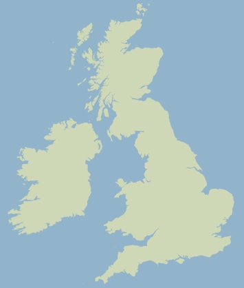
####The map A big thank you to Mike Bostock for his brilliantly clear D3 map tutorial. Conveniently for us, he generates a map of the UK!
####The animation By peering very closely at Fernanda and Martin’s visualisation I could see that there’s two effects in play: animation of curve length and fade in/out.
I experimented creating this effect with D3 by setting up two transitions on each line: the first extends and fades the line in and the second fades the line out. (Note I’m just using straight lines here!)
function lineAnimate(selection) {
    selection
	.attr({x1: 200, x2: 200})
	.attr('y1', function(d) {return d;})
	.attr('y2', function(d) {return d;})
	.style('opacity', 0.5)
	.transition()
		.ease('linear')
		.duration(1000)
	    .delay(function(d) {return d*10;})
		.attr('x2', 500)
	.transition()
		.duration(1000)
		.style('opacity', 0)
	.each('end', function() {d3.select(this).call(lineAnimate)});
}

d3.select('svg')
	.selectAll('line')
	.data([0, 5, 10, 15, 20])
	.enter()
	.append('line')
	.call(lineAnimate);
####The data Fernanda and Martin take their data from the National Weather Service which provides the data as a large grid. I haven’t looked for similar grid-based data for the UK, rather I’ve used the Met Office’s DataPoint service which provides a forecast for over 5000 sites in the UK. This data is not arranged as a grid which makes creating nice flowing curves more difficult, as interpolating between grid points is more challenging.
Another issue with the data is that it bunches in particular areas:

In hindsight I should’ve written (or found) a script that could progressively remove points that are close to others. What I actually did was modify the charting script to output a list of points that I’d clicked on… by hand. I spent about an hour clicking points within the dense areas, my eyes have only just recovered!

Another drawback of using this dataset was that the wind direction was quantised into just cardinal 16 directions which gives the wind a less smooth appearance.
####And finally There’s a few other desirable features such as using live data and I’d love to try using gridded data so that I can generate a smoother and more packed animation.
All in all I’m happy with the result, considering that this was an experiment. I think that it immediately conveys the nature of the wind and in a more emotive way than the usual method of using an arrow and a number.
See the chart here.
Finally, thank you to the Met Office for the data and Mike Bostock for D3.